Sample Imagery
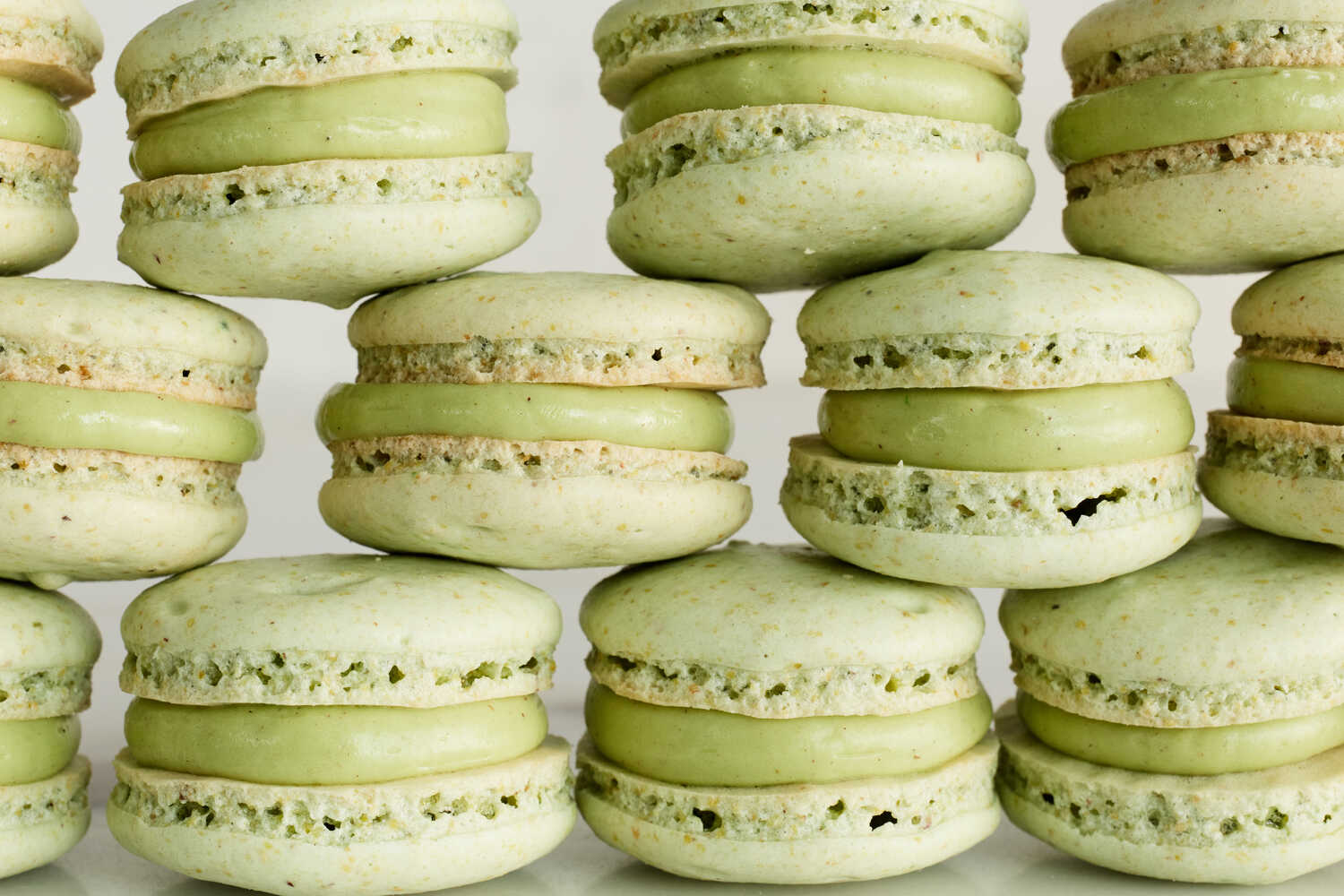
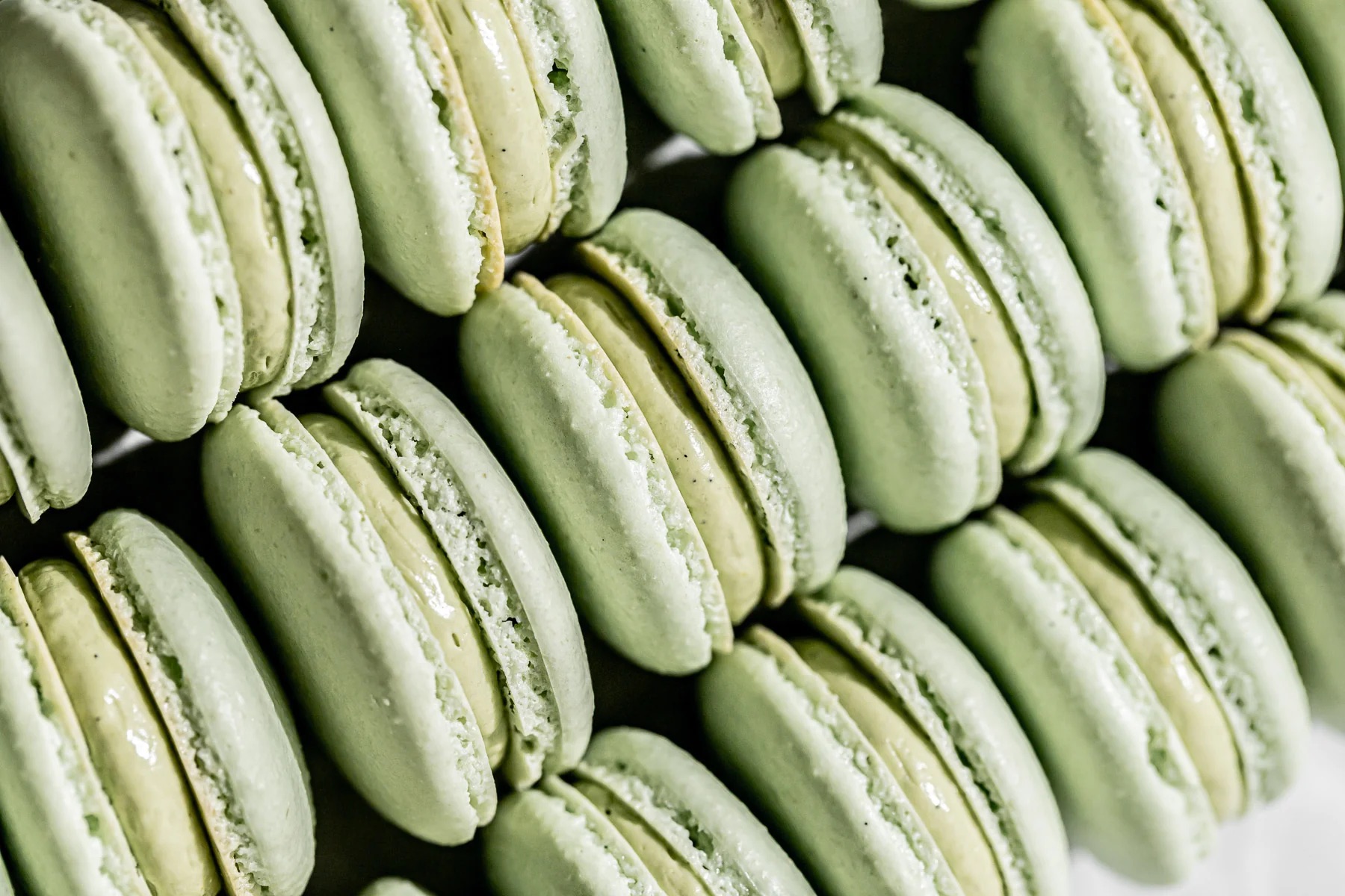
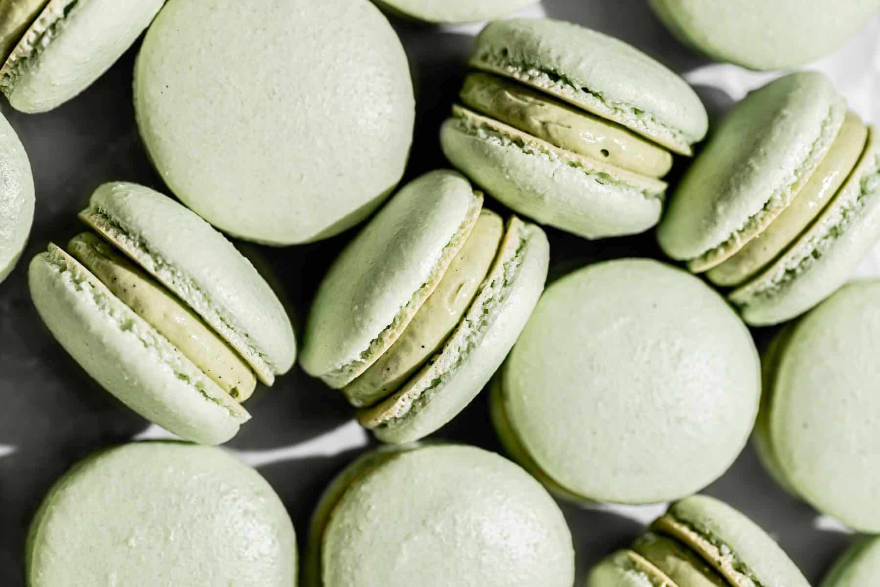
Pistachio macarons are meringue-based pastries featuring almond flour shells filled with pistachio-flavored cream. Renowned for their delicate textures and distinct nutty taste, mastering the art of crafting pistachio macarons demands precision and practice. Explore our step-by-step recipe guide to recreate these iconic treats in your kitchen.
This website is very clean and simple, making it easy to read. I found it helpful that the ingredients are all listed on the left side instead of at the bottom of the page. I do think, however, that the instructions being long paragraphs makes it slightly more difficult to just glance at the page and find where you left off as opposed to short bulleted instructions.
Sally's Baking AddictionThis website provides a lot of personal background and images before getting to the actual recipe, which I found annoying to scroll through. I also thought that the ingredients and bulleted recipe being placed after the detailed recipe to be counterintuitive. I prefer to see the overview of the recipe and ingredients before I dive into the nitty gritty.
Food NetworkThis website was laid out similar to the NYT site, as it included the ingredients to the left, with detailed instructions to the right. I found that I didn't have to do any scrolling to find what I was looking for. I noticed that the margins of the instructions are really excessive, so that only about 1/5 of the width of the screen is used, making it much longer than necessary, with a lot of wasted horizontal space.
I really enjoy the simplicity of this website, in that there are no excessively loud colors and/or decorations, and it uses majority black and white in the same font. It is straight to the point, and that makes it really easy to navigate and understand. I think this will be reflected somewhat in my own design, as I attempt to make my website as simple and user friendly as possible.
A24I think this website is interesting because it has a really large focus on images, and they take up the majority of the screen space on each page. I also like that the font size is really large and there is very little text on each page.
Magic SpoonI enjoy the color and whimsy that this website provides. It is very visually stimulating, and I noticed that they also use varying layout grid styles throughout the pages, which keeps it from getting boring. I also like that there are a lot of interactive components, such as hover states and animations.